
The Power of Color: Discovering Your Home's Perfect Palette

Blue and Orange color scheme
Introduction
Color is a cornerstone of interior design, wielding the power to transform spaces, evoke emotions, and communicate messages. As an interior designer, I've witnessed firsthand the profound impact that choosing the right interior color scheme can have on a home's atmosphere and its inhabitants' well-being.
In this blog post, we'll discuss the importance of color, explore how it influences our emotions and perceptions, and provide practical tips for homeowners to identify their perfect color palette.
The Importance of Color
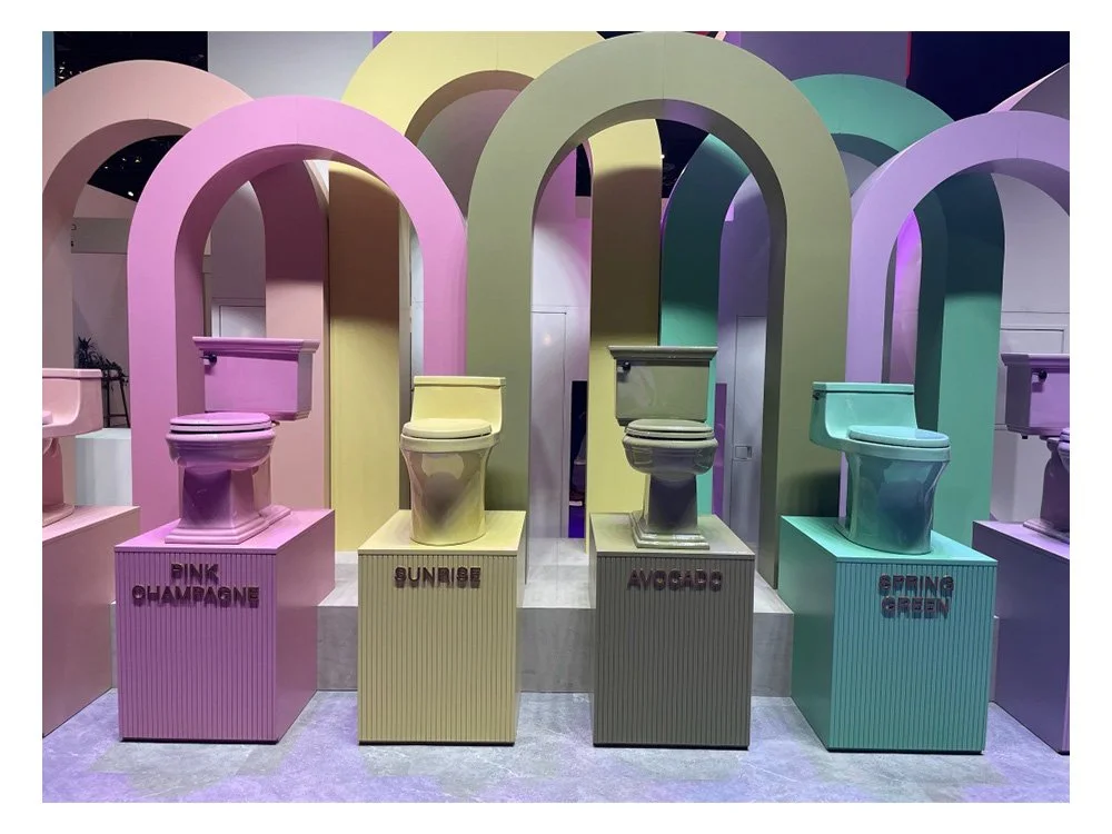
Kohler Booth at KBIS 2023
In the realm of design, color isn't just about aesthetics; it's a tool that can influence mood, perception, and even functionality. Understanding how color affects us is crucial when designing our living spaces. By harnessing the power of color, we can create environments that nurture and uplift us.
One of the most crucial aspects of utilizing color in design is understanding its psychological impact. For instance, warm colors like reds, oranges, and yellows tend to evoke feelings of energy, passion, and warmth, making them ideal for spaces where you want to stimulate conversation or creativity, such as dining rooms or offices. On the other hand, cooler colors like blues, greens, and purples can instill a sense of calmness, serenity, and relaxation, making them well-suited for bedrooms, spas, or areas designated for unwinding after a long day.
Moreover, color plays a pivotal role in creating visual harmony and cohesion within a space. By carefully selecting a color scheme that complements the architecture, furniture, and decor elements, you can tie together disparate elements and create a unified, cohesive look. Whether you opt for a monochromatic scheme for a sleek, modern aesthetic or employ complementary colors to add visual interest and energy, the thoughtful use of color can elevate the design of any interior space. For further exploration of color theory and its applications in interior design, websites like Houzz, Elle Decor, and Architectural Digest offer a wealth of inspiration and resources.
How Color Makes Us Feel
Color psychology is the study of how different colors influence human emotions and behaviors. While individual reactions to color may vary, certain hues tend to evoke universal feelings and associations.

- Red: Symbolizing passion, energy, and excitement, red is a bold and stimulating color. It can increase heart rate and adrenaline levels, making it ideal for spaces where activity and social interaction are encouraged, such as dining rooms or entertainment areas.

- Blue: Associated with tranquility, peace, and stability, blue has a calming effect on the mind and body. It's often used in bedrooms and bathrooms to promote relaxation and restful sleep.
- Yellow: Radiating warmth, happiness, and optimism, yellow is a cheerful and uplifting color. It can brighten up any space and evoke feelings of joy and positivity, making it perfect for kitchens or home offices.

- Green: Symbolizing growth, harmony, and balance, green is reminiscent of nature and the outdoors. It has a calming and rejuvenating effect, making it suitable for both living rooms and bedrooms.

- Purple: Signifying luxury, creativity, and spirituality, purple is often associated with royalty and sophistication. It can add a touch of elegance and mystery to any room, particularly in accents or furnishings.

- Brown: Earthy and grounding, brown evokes a sense of warmth, stability, and security. It's often used in rustic or traditional interiors to create a cozy and inviting atmosphere, especially in combination with natural materials like wood or leather.

- Orange: Vibrant and energetic, orange is a dynamic color that radiates warmth and enthusiasm. It can stimulate creativity and conversation, making it a great choice for social spaces like dining rooms or home offices.

- Black: Bold and dramatic, black adds depth and sophistication to any room. While it can be overpowering in large doses, black accents or statement pieces can create a sense of elegance and intrigue, balancing out lighter hues in the space.
Identifying Your Color Palette
Now that we understand the emotional impact of color, how can homeowners go about identifying their ideal color palette for their home remodels? Here are some practical tips:
Reflect on Personal Preferences
Begin by considering your own likes and dislikes when it comes to color. Think about the colors that resonate with you on a personal level and make you feel comfortable and at ease.
Consider the Purpose of Each Room
Take into account the function and purpose of each space within your home. For example, you may want calming and soothing colors for bedrooms, while vibrant and energizing hues may be more suitable for communal areas like the living room or kitchen.
Pay Attention to Existing Elements
Pay Attention to Existing Elements: Consider any existing furnishings, fixtures, or architectural features that will remain in the space. Choose colors that complement these elements rather than clashing with them. A simple color wheel or google search will help you identify a colors complement. For example, the complement of blue is orange, since it sits directly opposite on the color wheel. It gets a more complex as you start to bring in other colors and a good designer can help you navigate a scheme that will work best for you.
Experiment with Samples
Don't be afraid to experiment with paint samples or fabric swatches to see how different colors look in your space. Natural light, room size, and surrounding décor can all affect how colors appear, so it's essential to test them out in situ.
Seek Inspiration
Draw inspiration from interior design magazines, websites, or social media platforms like Pinterest or Instagram. Create mood boards or collages to visualize how different colors and textures can work together to achieve your desired look.
Conclusion
In the world of residential interior design, color plays a starring role in creating captivating and harmonious living spaces. By understanding the psychological effects of color and taking the time to identify your personal preferences, you can embark on a transformative journey to discover your home's perfect palette. Whether you opt for calming neutrals, vibrant accents, or rich jewel tones, remember that the colors you choose will not only enhance your home's aesthetic appeal but also influence the way you feel and interact with your surroundings. So, unleash your creativity, embrace the power of color, and let your home reflect the true essence of your personality and style.
Work with an award-winning interior designer to incorporate color into your home. Contact us to schedule a discovery call or in-home consultation.
Frequently Asked Questions About Interior Design Color Schemes
1. What are the best interior design color schemes for kitchens, and why?
Kitchens benefit from color schemes that stimulate the senses and encourage social interaction. Warm hues like yellow and orange enhance mood and appetite—yellow brings cheer and energy, while orange fosters enthusiasm and conversation. Green, a color associated with freshness and nature, is calming yet revitalizing—ideal for food prep areas. If you want a timeless palette, pair soft whites with earthy greens or muted blues to balance cleanliness with warmth. Natural light plays a big role, so always test colors in situ.
2. How does lighting affect interior design color choices?
Lighting changes the way we perceive color. In sunny Southern California homes, cool colors like sage, powder blue, or lavender can soften the suns intensity. North-facing rooms tend to feel cooler, so opt for warm neutrals like cream, peach, or beige to balance the tone. In artificial light, undertones become more apparent, so it’s crucial to test swatches during different times of day. Remember: warm light deepens red and orange hues, while cool light intensifies blues and greens.
3. How are color schemes use to evoke specific moods in different rooms?
Bedrooms: Soft blue, green, and lavender calm the nervous system and encourage relaxation.
Living Rooms: Warm, earthy tones like taupe, clay, or olive create comfort and connection—ideal for gathering spaces.
Offices: Orange and yellow stimulate creativity and focus, while muted greens improve concentration without overstimulation.
Bathrooms: Cool blues or aquas evoke cleanliness and serenity, reminiscent of water and spa environments.
Dining Rooms: Deep reds or burgundy promote appetite and conversation—classic choices for more formal settings.
4. What is the 60-30-10 rule in interior design color schemes?
This foundational design principle helps maintain visual balance:
60%: Dominant color (e.g., wall paint or cabinetry)
30%: Secondary color (e.g., upholstery, tile, or rugs)
10%: Accent color (e.g., artwork, accessories, pillows)
For example, in a kitchen: white cabinetry (60%), sage green tile (30%), and gold hardware (10%) create harmony and subtle contrast. This rule keeps your design grounded, even if you choose bold or trending colors.
5. Can I use more than one interior color scheme in a room?
Yes! But cohesion is key. Use this color wheel from Canva to find harmony through analogous (side-by-side) or complementary (opposite) hues. For example, pairing navy with terracotta creates rich contrast without clashing. A kitchen might combine cool sage cabinets with warm oak wood and copper accents. To unify the look, repeat tones throughout the room in varying textures—think velvet, matte paint, or glazed tile.
6. What color palette trends are emerging for 2025 in residential interiors?
2025 embraces emotional wellness through color:
Dusty greens and eucalyptus tones reflect a desire for natural calm.
Deep teals and eggplant evoke luxury and introspection.
Clay, sienna, and ochre ground the home in warmth and tradition.
Lavender grey and soft blush add ethereal elegance without overwhelming.
7. How can I choose a color scheme that’s timeless and not just trendy?
Stick with colors that reflect your personality and complement your home’s architecture. Neutrals with depth (like greige, warm white, or soft taupe) serve as a flexible backdrop for bolder accent colors that can change over time. Draw from nature and choose ocean blues, warm stone grey, and mustard yellow for palettes that never feel dated. Avoid trend-overload by using bold shades in easily changeable areas like pillows, rugs, or paint, while focusing on my classic finishes for fixed surfaces like tile, slabs and cabinetry.
8. How do I choose the right colors for my home renovation project?
Start by identifying how you want to feel in each space. Do you want to feel energized, relaxed, grounded? Use color psychology to align your palette with that emotion. Reflect on your personal preferences and test samples under different lighting. Don’t forget to consider existing materials such as flooring, furniture, and architectural details. Choose colors that complement rather than compete. When in doubt, JC Renovators can help you curate a palette that brings harmony and flow from room to room.