Color Scheme Trends for Residential Interior Design in 2026
Color is a tool that influences how you feel, how your home functions, and how it supports your well-being. If you’re thinking about remodeling or building a new home in 2026, it’s time to start considering how color can shape your space. This year, I’m predicting a move toward natural, wellness-driven palettes inspired by earth, water, and the quiet comfort of home. Think soothing greens, toned blues, soft neutrals, and natural textures that create balance and calm.
Client driven design
Combining elements and colors a client loved and making it feel balanced, this space truly reflects their personality.
Why Color Matters
Color sets the emotional tone of your home. The right palette can make a space feel open and calm, cozy and grounded, or sophisticated and bold.
Soft, muted hues promote relaxation and harmony.
Richer, deeper tones add depth, luxury, and character.
Texture enhances the emotional effect of color. A soft linen wallpaper, plastered wall, or boucle sofa adds dimension and warmth.
When thoughtfully layered, color and texture elevate your home from simply beautiful to deeply personal.
The 2026 Design Climate: Natural, Restorative, and Intentional
From my perspective as a designer, the upcoming year will be all about restoration and authenticity. Homes are becoming sanctuaries, and people want spaces that help them feel grounded and at peace.
Here’s what I see emerging in 2026:
Nature-inspired tones are taking center stage. Soft greens, warm neutrals, and ocean-inspired blues connect us to the outdoors.
Texture and material are key. Paint is only part of the story. Layering textured fabrics, wallpapers, and finishes will create depth and interest.
Intentional design choices are replacing short-lived trends. Homeowners want spaces that feel fresh but will stand the test of time.
These trends reflect how people are living now, seeking balance, warmth, and a sense of calm within their homes.
Ready to bring wellness and timeless style into your home? Let’s start a conversation about how the right color palette can transform the way you live.
The Connection Between Color, Wellness, and Biophilic Design
In my previous biophilia blogs, I talked about how light, sound, and natural materials influence wellness. Color plays an equally powerful role in creating a home that feels good to live in. Below are just a few ways color can effect our mood.
Greens and blues mimic nature’s calming energy. They lower stress and encourage relaxation.
Warm neutrals and earthy tones add comfort and stability, creating a sense of rootedness.
Deeper, dark tones create intimacy and are perfect for cozy spaces like libraries, bedrooms, or dining rooms.
Textures and natural materials, like woven grass cloth, matte plaster, or linen drapery, enhance these effects by engaging the senses.
Additionally, you can bring biophilic color into your home through:
Paint and wallpaper
Upholstery and drapery
Cabinet finishes
Tile, stone, and metal accents
Even small details like nature patterned throw pillows, rugs, and artwork
When all these elements work together, the result is a space that not only looks beautiful but feels restorative.
My Three Predicted Color Palettes for 2026
These are my personal predictions and favorite palettes for 2026 remodels and new builds. They reflect the natural beauty of the Southern California landscape and the desire for homes that feel elegant, grounded, and livable.
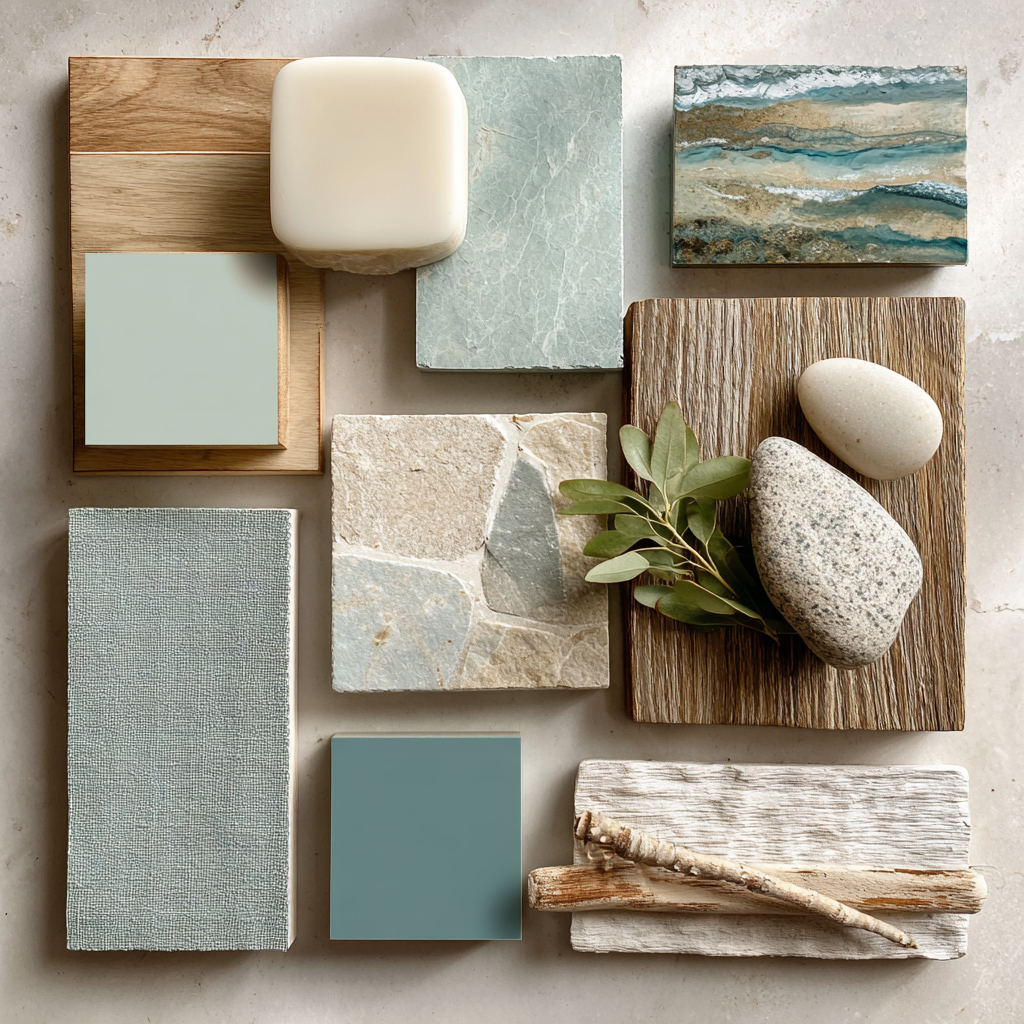
Palette 1: Sea Breeze Retreat

A soft, light and airy color palette perfect for a relaxed, breezy day
Color Story
This palette layers soft aquamarine, muted sage, and creamy off-white to capture that effortless coastal calm we love in Orange County.
Sherwin-Williams Suggestions
SW 6478 Watery – soft blue-green
SW 6213 Halcyon Green – dusty sage
SW 6204 Sea Salt – airy neutral with a hint of green
SW 7624 Breezy – muted teal
Where to Use It
Walls in Watery, trim and ceilings in Sea Salt for a seamless tone-on-tone look
Built-ins or kitchen cabinetry in Halcyon Green with brushed brass hardware
Wallpaper in a soft organic pattern in aqua and sage tones
Linen drapery in off-white, textured chairs in Breezy blue
The Feeling It Creates
Serene, open, and fresh. Ideal for bedrooms, family rooms, and spa-like baths. The natural blue-green tones encourage relaxation and bring the outdoors in.
Palette 2: Forest Depth
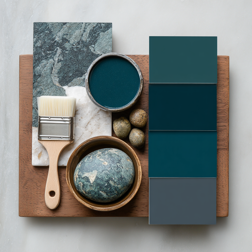
Rich, bold and grounding
Color Story
This palette brings together deep pine green, dark teal, and soft charcoal for a sophisticated and dramatic look. It’s perfect for clients who want their home to feel warm and cocooning.
Sherwin-Williams Suggestions
SW 9660 Tarragon – deep pine green
SW 6474 Raging Sea– moody teal
SW 7069 Grizzle Gray – warm charcoal
SW 7622 In the Gray – slate blue accent
Where to Use It
Walls, trim and ceiling in Tarragon for a full, enveloping “color-drenched” room
Kitchen or bar cabinetry in Raging Sea with brass hardware
Built-ins or shelving in Grizzle Gray
Velvet upholstery or drapery in In the Gray for added luxury
The Feeling It Creates
Sophisticated and intimate. This palette works beautifully in dining rooms, libraries, or master suites. It feels elegant and timeless, not trendy.
Palette 3: Sun Warmed Stone & Sand
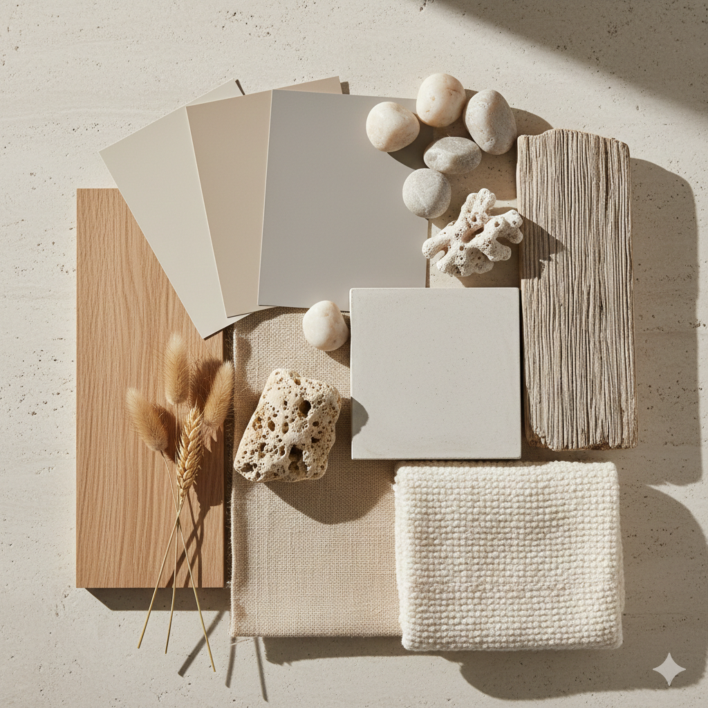
Warm, grounded, and quietly luxurious
Color Story
This palette is inspired by sun-baked stone, soft sand, and the warmth of natural minerals. Warm taupe, gentle greige, and muted sand tones create a sense of comfort and understated elegance. It’s ideal for homeowners who want a neutral home that still feels layered, intentional, and rich rather than stark or flat.
Sherwin-Williams Suggestions
SW 7036 Accessible Beige – warm, versatile greige
SW 7527 Nantucket Dune – soft sandy neutral
SW 7030 Anew Gray – warm taupe with depth
SW 7648 Big Chill – soft stone gray for contrast
Where to Use It
Walls in Accessible Beige or Nantucket Dune for a warm, light-filled foundation
Trim, doors, or millwork in Anew Gray for subtle contrast without heaviness
Fireplace surrounds or built-ins in Big Chill for a refined architectural moment
Upholstery in textured linens, wool blends, or bouclé in sand and stone tones
The Feeling It Creates
Calm, grounded, and timeless. This palette feels welcoming and elevated without demanding attention. It’s perfect for living rooms, open-concept spaces, kitchens, and primary suites where you want warmth, flexibility, and longevity. The tones adapt beautifully from day to night and pair effortlessly with wood, stone, and metal finishes.
How to Bring These Palettes to Life
Here are a few designer tips to use color intentionally in your home:
Start with the room’s purpose. Choose soft, calming hues for restful spaces and deeper tones for rooms that need energy or warmth.
Pick one hero color. Use it on walls or cabinetry and build the rest of the palette around it.
Layer texture. Mix matte paint, plaster, fabric, stone, and metal finishes for dimension.
Test your colors. Always view samples in your space, in both natural and evening light.
Balance with neutrals. Warm whites, taupes, and creams help these palettes feel elegant and timeless.
Coordinate finishes, with your color palette in mind. For example, brushed brass and warm wood tones complement blues and greens beautifully.
Why These Palettes Resonate with Orange County Homes
Abundant natural light enhances these colors. They feel connected to the ocean, hills, and open skies.
These tones reflect how people want to live—comfortably, calmly, and with a sense of wellness.
Natural color and texture communicate quiet confidence and sophistication.
They’re timeless. Even as trends shift, these palettes stay beautiful and relevant.
Bringing It All Together
Color is one of the most powerful tools in design. When chosen thoughtfully, it creates emotion, defines function, and brings your home to life.
For 2026, expect to see homes embracing natural hues that soothe and inspire. Greens and blues in particular will continue to dominate, but in softer, earthier tones that reflect balance, wellness, and beauty.
If you’re planning a remodel or new build, I’d love to help you select a palette that reflects your lifestyle and enhances the way you feel at home. Together, we’ll create a design that feels fresh, timeless, and uniquely yours.
What’s Next?
If you’re interested in learning more about how we can help with your home remodel, new build, or color refresh, contact us to set up a discovery call.
Frequently Asked Questions
1. How do I choose the right color palette for my home?
The best place to start is with how you want your home to feel. Color influences mood, energy, and comfort. Natural light, architectural details, and how rooms connect all matter more than isolated color trends. A well-chosen palette supports both the function of each space and your overall sense of well-being.
2. What paint colors will be popular in 2026?
In 2026, color is moving toward wellness-driven, nature-inspired hues. Soft greens, mineral blues, earth-tone pinks, muted reds, and warm neutrals are replacing cooler grays and stark whites. These tones feel calming, grounded, and timeless rather than trendy.
3. Are earth tones and warm colors timeless or just a trend?
Earth tones are rooted in nature, which gives them staying power. When thoughtfully selected and layered with texture, they age far better than trend-driven colors. The key is choosing softened, complex versions rather than bold or saturated shades.
4. How does natural light affect paint color?
Natural light dramatically changes how a color reads throughout the day. Morning, afternoon, and evening light can shift undertones and depth. That’s why it’s important to test samples in your home, on multiple walls, and observe them over time before making a final decision.
5. Can I mix blues, greens, and earth tones in the same home?
Yes! And when done correctly, it creates a layered, cohesive look. The secret is balance and repetition. Using similar undertones and weaving colors through finishes, textiles, and materials helps the palette feel intentional rather than scattered.
6. How much color is too much in an interior?
There’s no fixed rule, but successful spaces rely on balance. Color feels overwhelming when it lacks contrast or texture. If you love a lot of color, layering matte finishes, and natural materials softens the effect and keeps the space feeling calm.
7. Should I choose paint colors before selecting finishes and furniture?
Ideally, paint should come later. Finishes such as tile, stone, and cabinetry, and furnishings can have more visual weight and fewer options than paint. Once those are selected, choosing paint becomes easier and more precise.
8. How do I use color to support wellness in my home?
Colors inspired by nature promote calm and emotional balance. Deeper tones can create intimacy in bedrooms or dining rooms, while lighter hues help open and relax shared spaces. Texture and natural materials enhance these effects.
9. Do I need a designer to help with color selection?
Many homeowners feel overwhelmed by color decisions because they’re trying to make choices in isolation. A designer looks at the entire home holistically such as natural light, architecture, materials, and lifestyle, to ensure colors feel cohesive and intentional. A good designer can help you define the perfect color palette for your home and lifestyle.
10. How does JC Renovators support clients with color and design decisions?
At JC Renovators, color selection is integrated into a comprehensive design process. We develop palettes alongside finishes, furnishings, and architectural details so every choice works together. Whether you’re remodeling or building new, we guide you toward solutions that reflect how you live and want to feel in your home.